Blog
Fancy Nite-Lite
April 30th, 2008
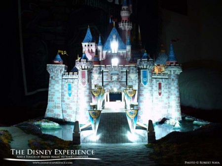
Here’s a sample of the type of art that I like to do in my spare time. I rebuilt my Sleeping Beauty Castle paper model, and created a nice diorama base. It lacks water, trees, and low-lying shrubbery, but I plan to add them later.
I love experimenting with all types of art and mediums, especially the more unconventional ones. What’s really exciting is when I combine them, like paper models and miniature landscaping. I also like painting on Shrinky Dink plastic. You can create miniature masterpieces with Shrinky Dinks and acrylic paint. Add a little too much paint, though, and it bubbles & wrinkles—not good for a mini Picasso, but excellent for miniature knarled/rotted wood.
The One Rule of Art . . .
April 22nd, 2008
. . . is that there are no rules. This is a philosophy that I’ve always firmly believed in. An artist can’t have any limitations if they expect to be creative. An artist has to be free to explore, to look beyond pre-conceived ideas of what can/can’t or should/shouldn’t be done.
Yes, there are classical guidelines, mediums, and techniques that you learn about in school, but they’re by no means the only ones. And nothing is ever written in stone! Feel free to explore anything that you like, even unlikely avenues. Not that they’ll all succeed, but it’s better to have the knowledge and know-how for future works that may require a non-traditional approach. Just because you’re working with paint doesn’t mean you’re limited to a brush, roller, or pallet knife!
“That’s not art.” Poppycock! Get this type of mentality out of your head. And I’m speaking to everyone, artists and non-artists. Art is all around you. Unless you’re sitting at your computer naked right now, art designed your clothes. For those of you who are naked, art designed that chair you’re sitting in. Art had a hand in homes, cars, furniture, appliances, and everything that has a shape and any type of color. For all of you macho, man’s man type of guys out there, you have a butt-load of art in your garages and your tool chests. Someone had to design those power tools, right? I’ll bet one of the factors in purchasing them was how attractive they were, right? Don’t be ashamed; power tools (especially modern ones) are handsome. They’re a great example of combining form (the artistic design) with function. Art doesn’t have to be “fancy-foo-foo-pretty” or even accepted . . . it’s just a fact.
Don’t break the mold. When you’re working on a commission or a project in art class, you’re more than likely going to have some set rules. And that’s fine; you need to learn to appeal to what the client/instructor wants. So, if you want that paycheck or passing grade, don’t break the mold. Ooze out through the cracks in the mold! One thing I always did in high school and college was to find some way to bend the rules without breaking them. It forced me to be creative, and it ensured that my art always stood out in the class—an easy thing to do when everyone else is strictly following the rules.
If making it easy helps, go ahead and do it. Fell free to trace! Yes, trace. A lot of people have this strange notion that art has to be created from scratch. “You have to draw it by hand.” Popycock! I say that if tracing helps, go for it. The toughest thing to learn in art is the human figure. It doesn’t matter if you’re drawing just a finger; it’s hard, and most artists have to work hard at it. If tracing a photo helps you get the shapes and proportions just right, go for it. Now, I draw the line at trying to pass off a tracing as an original work of art.
The most artistic freedom you will ever have is when you are doing art for art’s sake.
POTC System Icons Preview #9
April 8th, 2008
POTC System Icons Preview #8
April 8th, 2008

Business Cards
April 7th, 2008
For the past 7-10 years, I’ve been creating business cards for the officers at my Dad’s police department. Each officer has their own customizations, especially the K-9 officers, who like to put their dog’s photo onto the cards. Well, I just got word that the new chief has made the decision that all officers will now use a single design picked out by him (designed by him, too, I think), and they will be printed by whatever company he chooses. So, I’ve essentially lost a tad bit of income, though not much.
I’ve been told that this decision has caused some uproar in the department; the fellas really love their customized cards. The only thing I won’t miss is cutting out 250 cards for a single order. Cutting is very tedious and boring. At least my printer will get a reprieve, and I won’t go through toner so quickly.
Que sera, sera.
POTC System Icons Preview #7
April 6th, 2008

POTC System Icons Preview #6
April 4th, 2008

This is one of several icons that had to be revamped because they were substandard. The original version of this icon had a skeleton parrot perched on top of the chest. The parrot was hard to see on the smaller icons (tiny bones), so I went with a more familiar parrot perched atop a shovel. Now it clearly resembles the beach scene in the Disneyland attraction’s arcade queue.
The chest is actually one that can be found over at the Pirate’s Lair on Tom Sawyer’s Island.


